

The brief requires a creative demonstration of the learned techniques from the semester, these include, ‘original image content, graphic elements, colours, and typographic formatting.
I have a great interest in historical art, particularly the symbolic depictions of women and female artists who have made a great impact on the world. I decided to create a zine, depicting a list of my favourite female protagonists, or heroines. By appropriating the images through collage, I aimed to highlight their place in the world when they were painted, and the historical implications of their famous depictions. I think it’s interesting to consider the contrast between traditional formats of art and amalgamate it with our modern creation processes. “Items such as oil paintings, sculptures and architecture are said to be art and to possess a sense of permanence while the products of graphic design, such as labels, posters, books and magazines are seen as impermanent and transitory” (Barnard, M. (2005)


When editing ‘The Birth of Venus’ I incorporated the Italian translation of the title, ‘Naschita di Venere’ in my own cursive. The flowers floating over the page are clipped from the original artwork and gave the written content an addition to the visual hierarchy. The quote by Demetrios Chalkokondyles is believed to be the closest textual scene that could have inspired Sandro Botticelli.
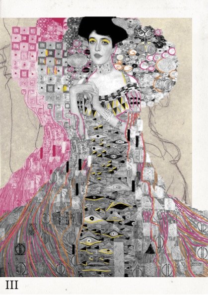
‘The Portrait of Adele Bloch-Bauer’ was interesting to edit, it is a detailed piece of work, embellished with geometric shapes, I wanted to add to the image not destroy it. I ended up using almost neon pinks, yellow, and orange which contrasted against the greyscale beautifully. “color works at this basic level, it is very good at keeping things defined, reinforcing informational hierarchies, guiding the eye through complex systems and data, and aiding navigation through physical spaces”(Dabner, D. 2023).
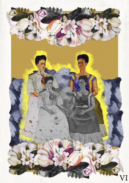
The ‘Las Dos Fridas’ page stands on its own with the floral element. I revised Frida Kahlo’s ‘Magnolias’ (1945) and used the same pink and orange over the middle blooms. The typefaces I used were ‘Rough Love’ on the front cover and quotes, ‘Futura’ in the body text, and ‘Jeanne Moderno OT’ for the titles, (originally ‘Hegante’). The San serif text works in contrast to bold visuals on the opposing page, allowing the viewer to appreciate the imagery before the context.